02 UX/UI Design·2023·Mobile App

Voya

Redesigning a multi-step combinational travel system into a guided mobile-first experience.

Role
UX Research · UI Design · Prototyping
Domain
Travel · Consumer
Tools
Figma
Type
Redesign
Redesigned Voya mobile booking experience showing the guided step-by-step flow
01
Situation

A German travel platform specializing in combinational trips – powerful booking logic, heavy user experience

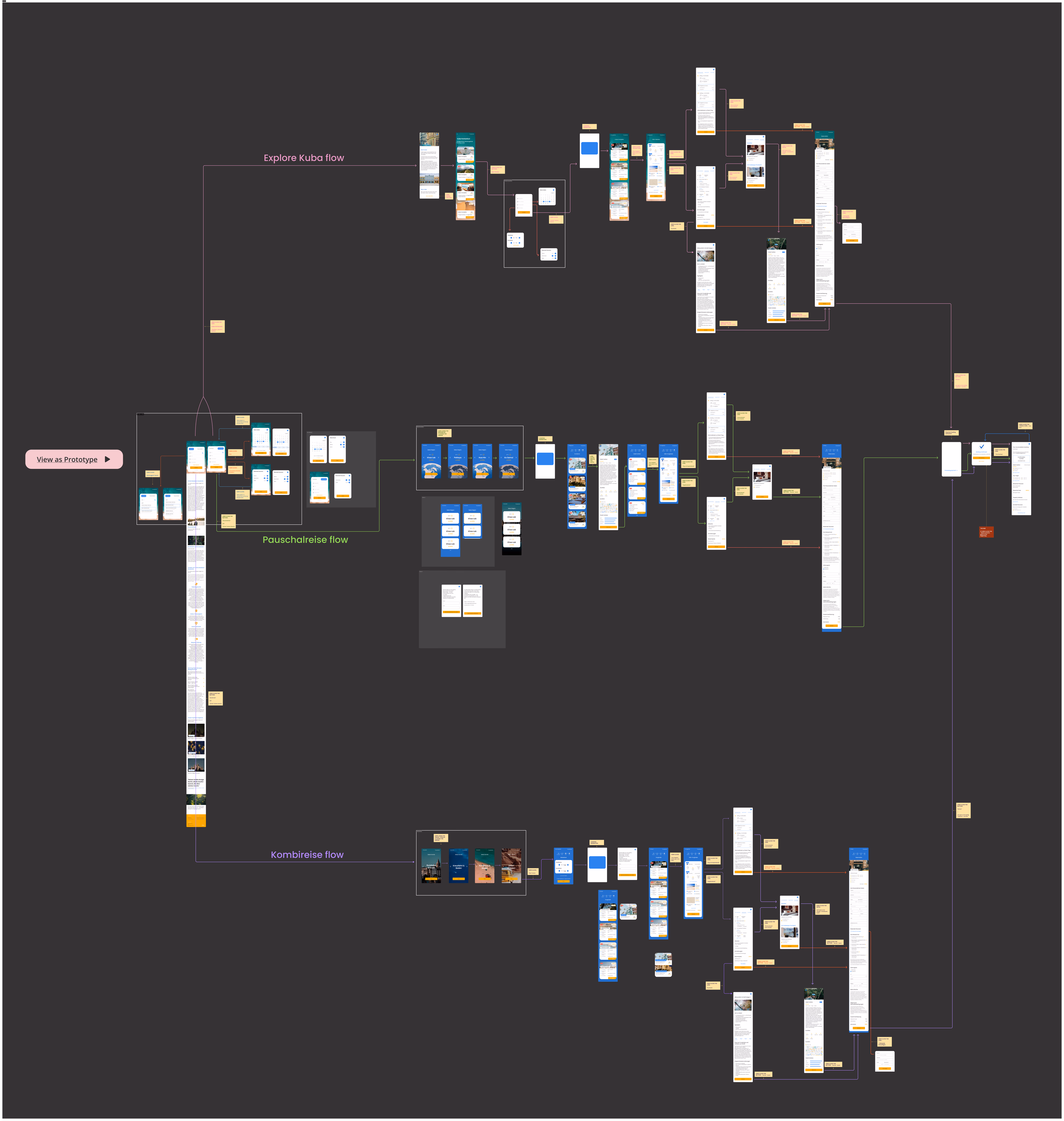
Voya bundles city + beach packages into one structured booking, with flexible configurations across destinations, durations, airports, and hotel dependencies. The product logic is sophisticated by design.

The existing experience exposed the entire system at once – every option visible before users had expressed a single preference.

The product logic is powerful.
The experience, however, was cognitively heavy.

Legacy Voya interface exposing full booking configuration upfront across a dense desktop layout
Legacy interface · full booking configuration exposed upfront · desktop-first patterns
02
Problem

How might we make a structurally complex travel booking system feel simple, guided, and calm – without removing its flexibility?

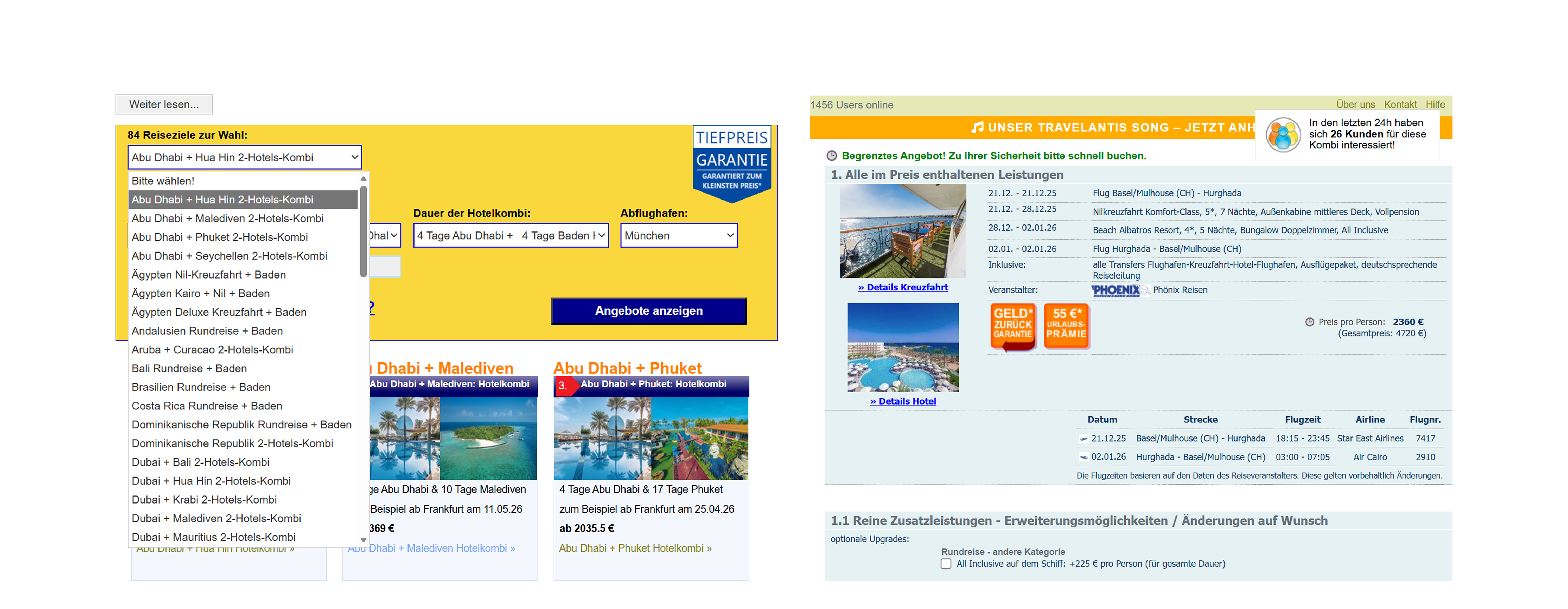
The existing experience exposed the entire system at once. Users were confronted with dense dropdown logic, multiple simultaneous decisions, competing price signals, desktop-first layout patterns, and visually heavy information blocks.

No progressive disclosure
Every option appeared simultaneously. The system made no attempt to sequence the decision – users confronted the full catalogue before expressing a single preference.
Weak information hierarchy
Price displays, promotional banners, and filter controls competed for equal visual weight. Nothing signalled what to engage with first or which action would move the booking forward.
Multiple competing actions
Many paths forward at every stage, but none identified as primary. Users had to decide how to decide before they could start booking.
Unstructured decision sequencing
Every step was accessible from every other, so none felt necessary. Users couldn't build confidence incrementally – progress was invisible.
03
Approach

Three principles derived from analyzing how leading platforms handle the same complexity

Platform Decision staging Single primary CTA Progressive disclosure Visual hierarchy Priced in context
Voya – legacy
Booking.com Yes Yes Partial Partial Yes
Airbnb Yes Yes Yes Yes Partial
01
Stage decisions, never stack them
Each screen presents one choice. Destination before dates. Dates before duration. The sequence follows how people think about travel, not how the database is structured.
02
Delay complexity until it's earned
Advanced options appear only after a core selection is confirmed. The system reveals depth when it knows enough about the user to make that depth relevant.
03
Price means more in context
Pricing is placed after intent is established. The same number reads differently once the user already knows they want the trip.
Full journey exploration and component system during the system mapping phase in Figma
System mapping phase · full journey exploration · booking logic separation
04
Design

Destination → Hotel Selection → Room Selection → Summary

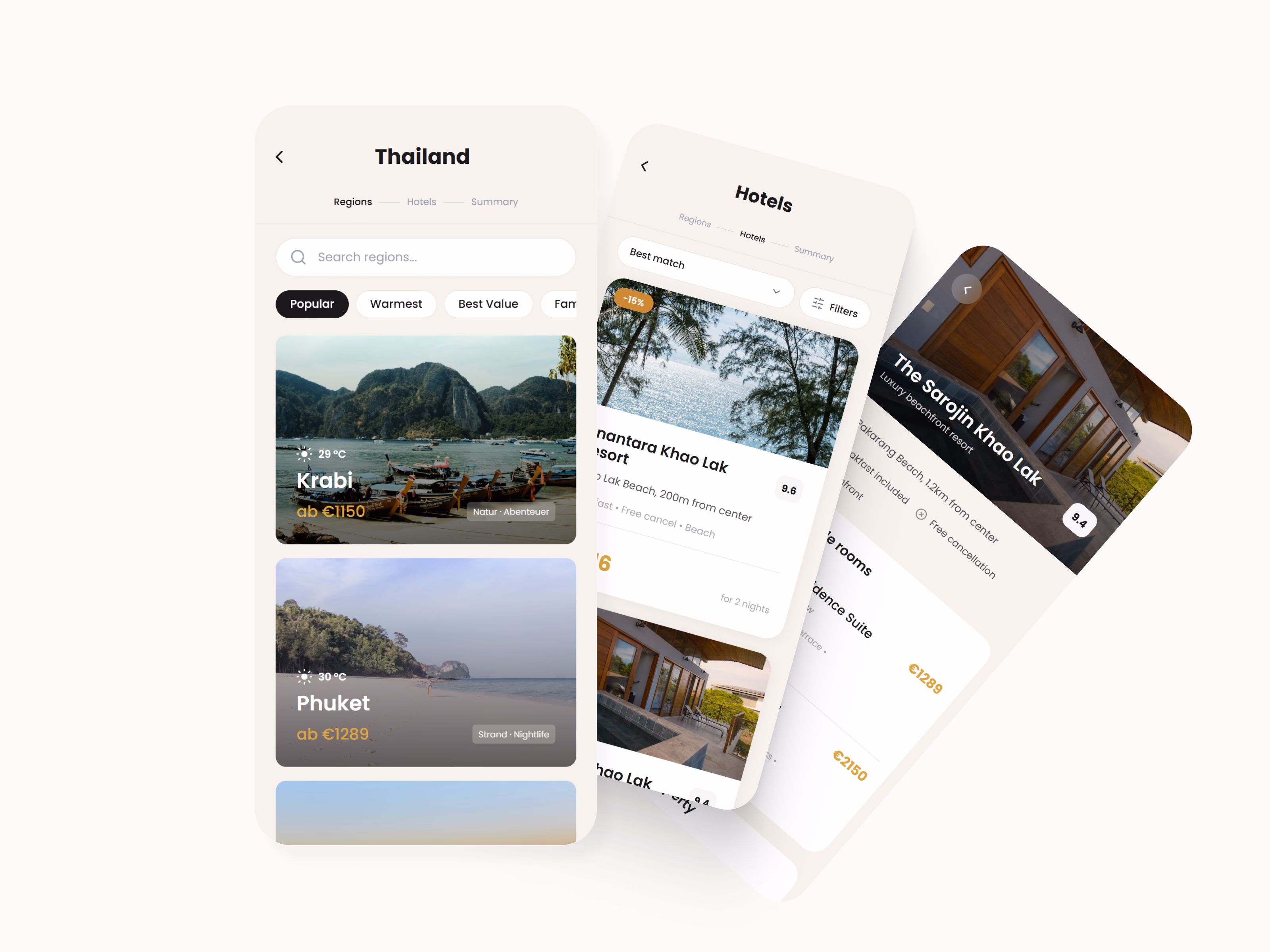
Instead of showcasing every legacy flow, the redesign focuses on one journey – demonstrating how structural clarity transforms the experience at each step.

One primary action per screen. A visible progress indicator throughout. Pricing surfaced at the point it can mean something, not before.

Guided mobile-first booking journey showing the step-by-step flow from destination through to summary
Guided mobile-first booking journey · progressive disclosure · clear step progression
05
System

Six improvements that replaced one overwhelming screen

01
Step progression
A visible progress indicator at every stage. The booking feels finite and achievable, not open-ended.
02
Calm visual system
Reduced color noise. Nothing competes. One thing matters on each screen.
03
Typographic hierarchy
Size and weight signal importance before the user reads a single word.
04
Pricing transparency
Prices appear in context – after intent, alongside the trip shape the user has chosen.
05
One primary action
Every screen has exactly one obvious next step. Choosing is the only action available.
06
Reduced decision density
Each step asks for less. Complexity is earned by the user, not imposed on them.
06
Final Flow

End-to-end experience

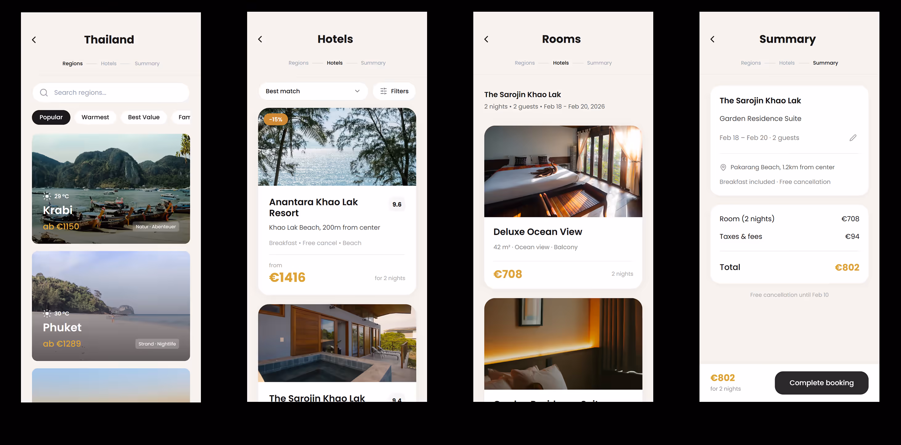
The redesigned journey demonstrates how complex systems can feel intuitive when structure, pacing, and hierarchy are aligned.

End-to-end booking experience · structured complexity · calm interaction pacing