09
Branding·Web Design·2024
Café Puschkin
Visual identity and website design for a Leipzig café and cultural venue.
Visual identity and website design for a Leipzig café and cultural venue.
Café Puschkin sits in Leipzig's Südvorstadt – a neighbourhood that has always blurred the line between academia, arts, and everyday life. Since 1994 it has served coffee in the morning, hosted jazz and theatre in the evening, and named itself after Alexander Pushkin all along. That combination needed a visual identity that could hold all of it at once without looking like it was trying.
Working with Lilaquadrat, the brief was to design an identity system and website that honored the café's literary name and its role as a living cultural venue – and then make the whole thing functional for daily operations.
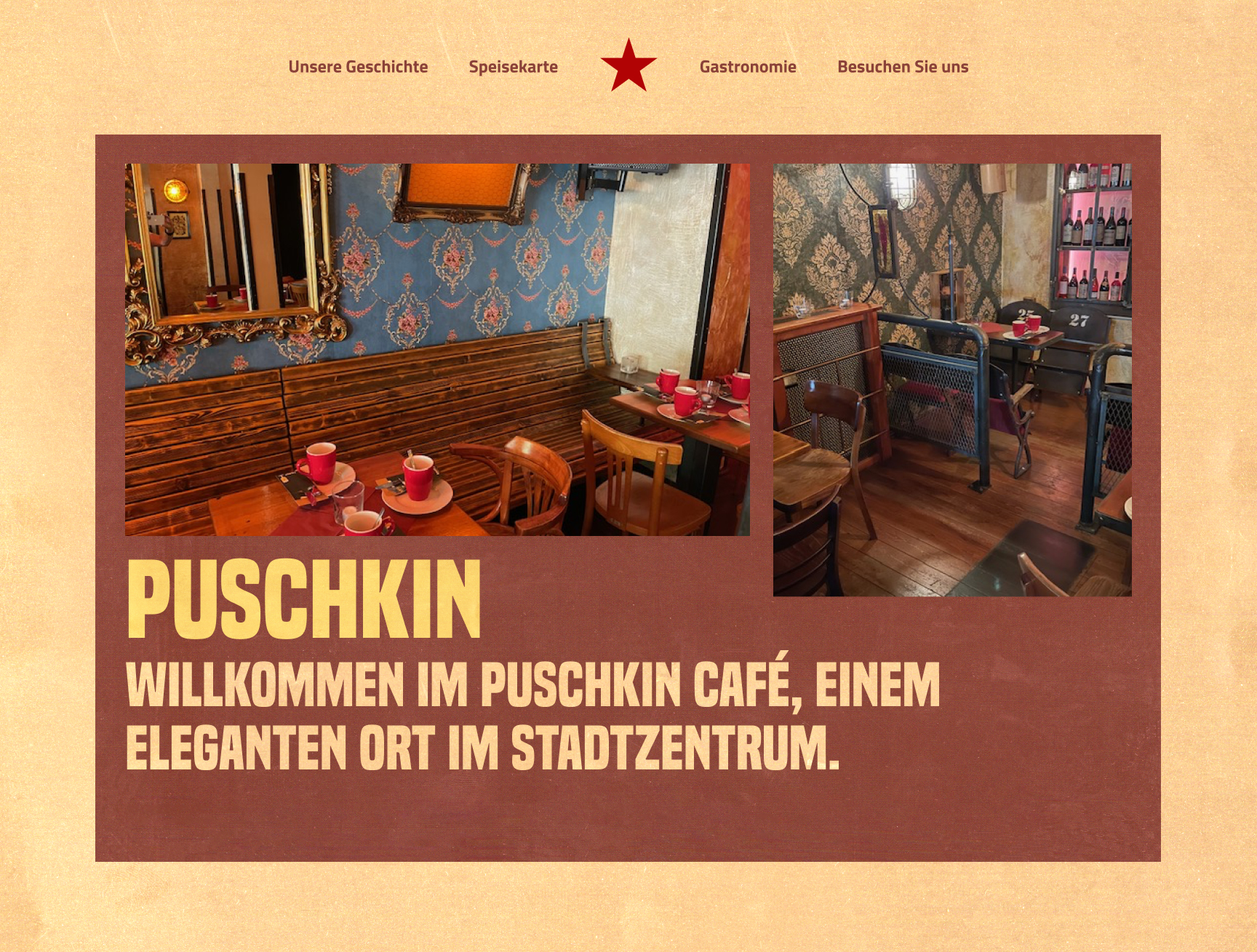
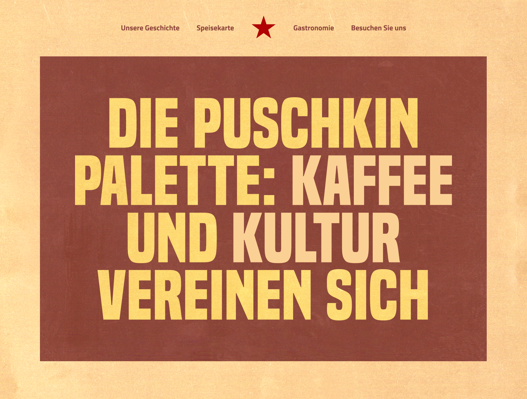
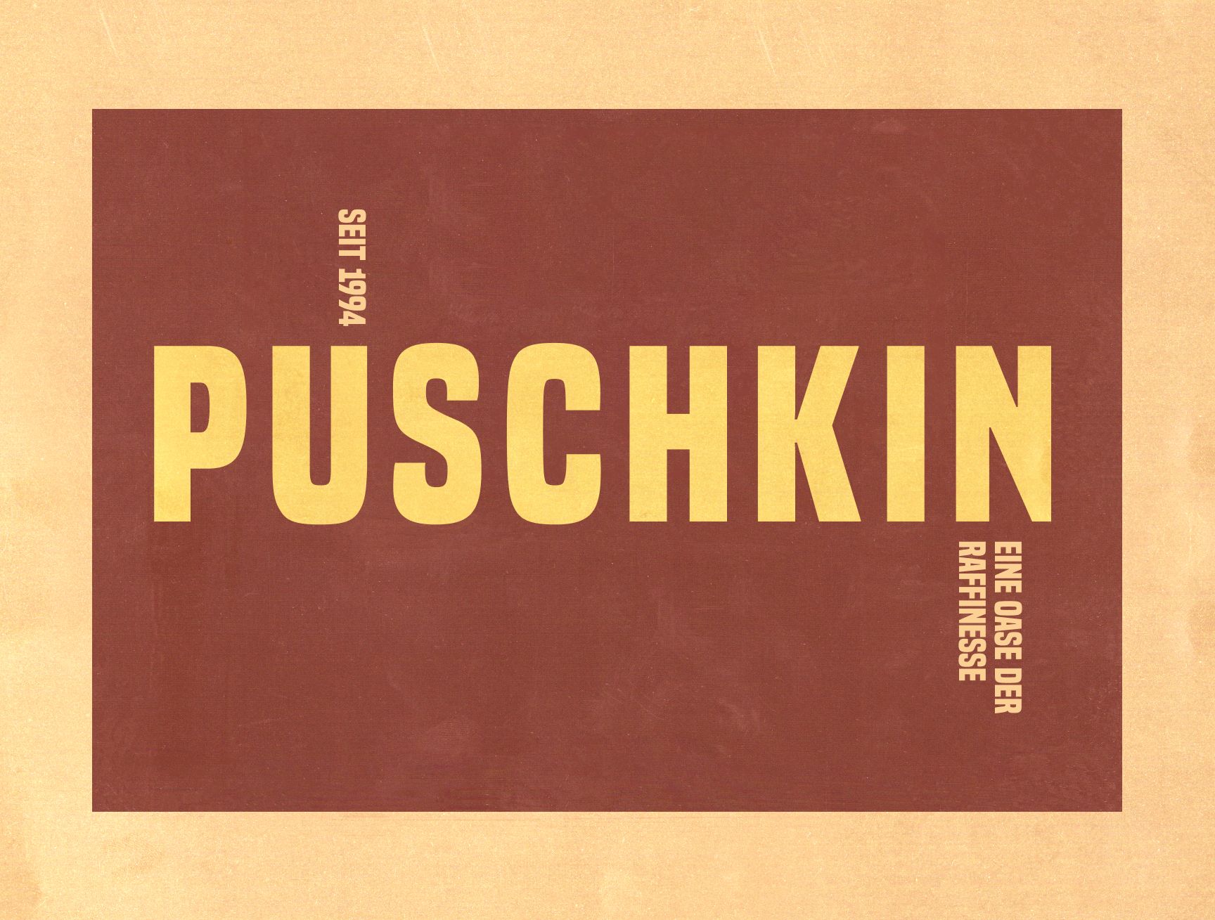
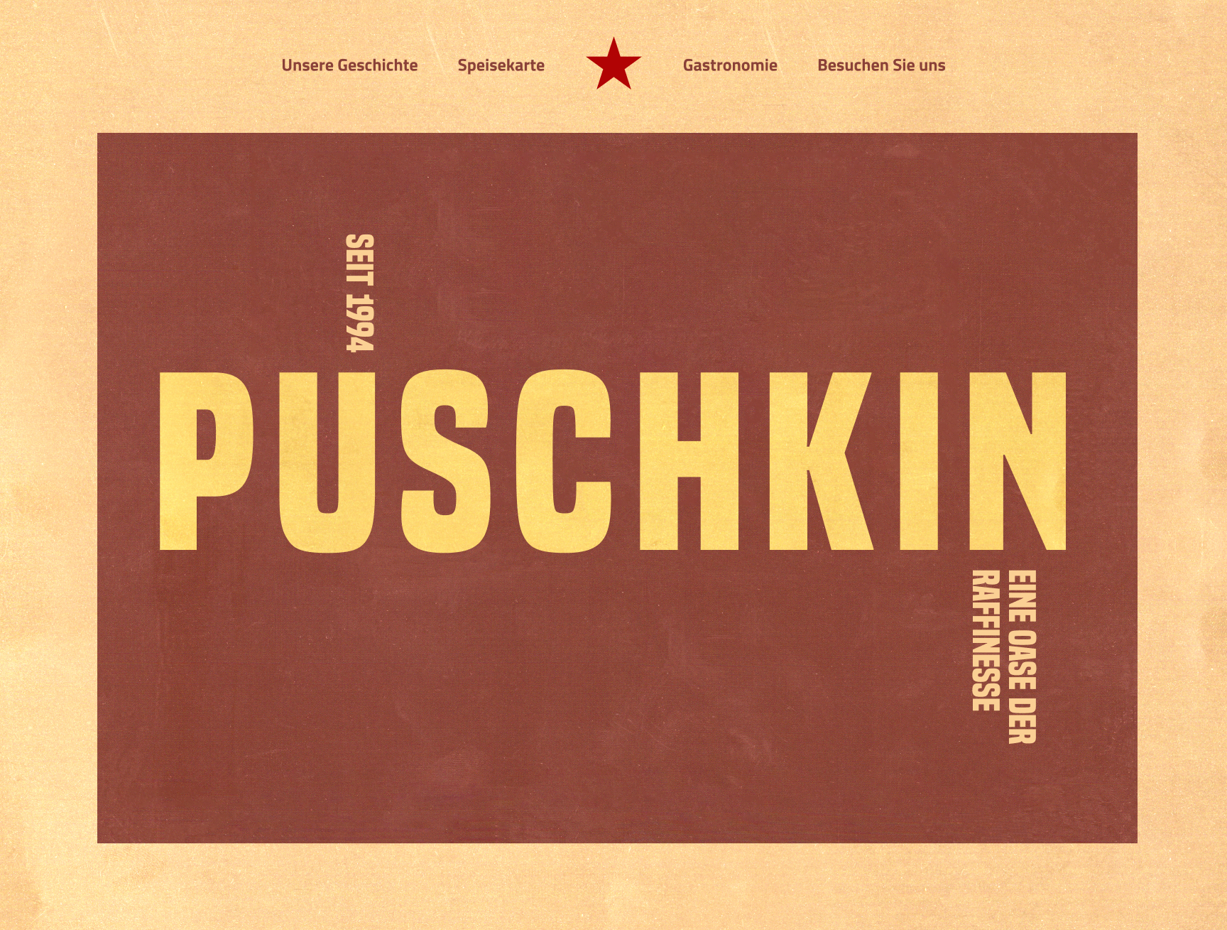
The answer came from constructivist print culture. Bold condensed letterforms that fill the frame, rotated text as a structural device, a warm palette of dark red and aged cream – all drawn from the visual language of Soviet propaganda posters. It is not pastiche. The reference is legible but the execution is contemporary.
The textured paper ground adds weight and age without nostalgia. On screen it reads as a cultural artefact. In print it holds up as a proper identity. The red star in the navigation is the only decorative element – and it does real work, anchoring the mark across every touchpoint.
A name drawn from Russian literature.
An aesthetic drawn from Soviet constructivism.
The system had to hold both without compromise.
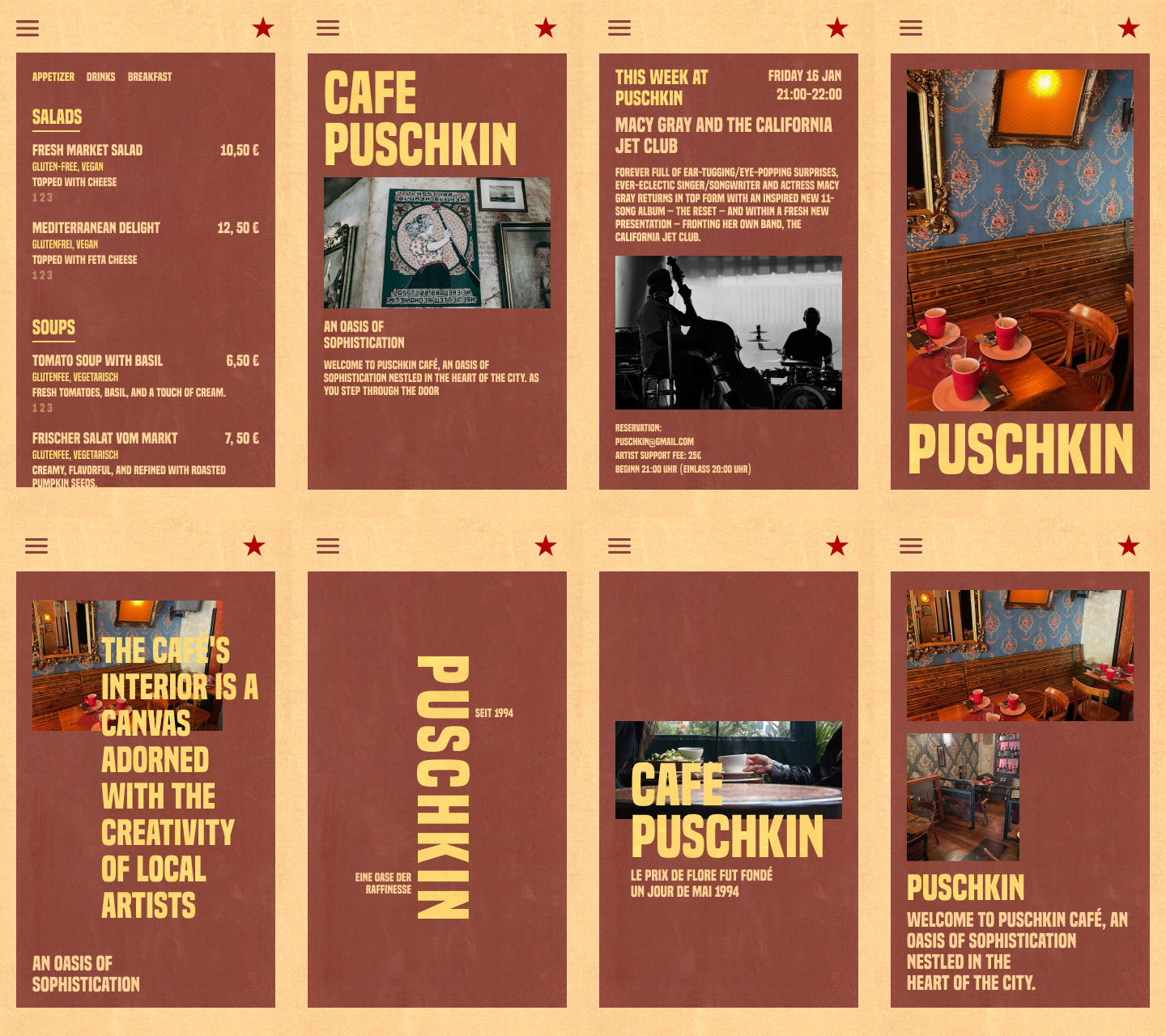
The visual language holds across every format. On mobile, each screen becomes a bold typographic object – menu cards, event announcements, and venue photography all use the same condensed type and warm palette. The identity is recognisable at thumbnail size and at full screen.
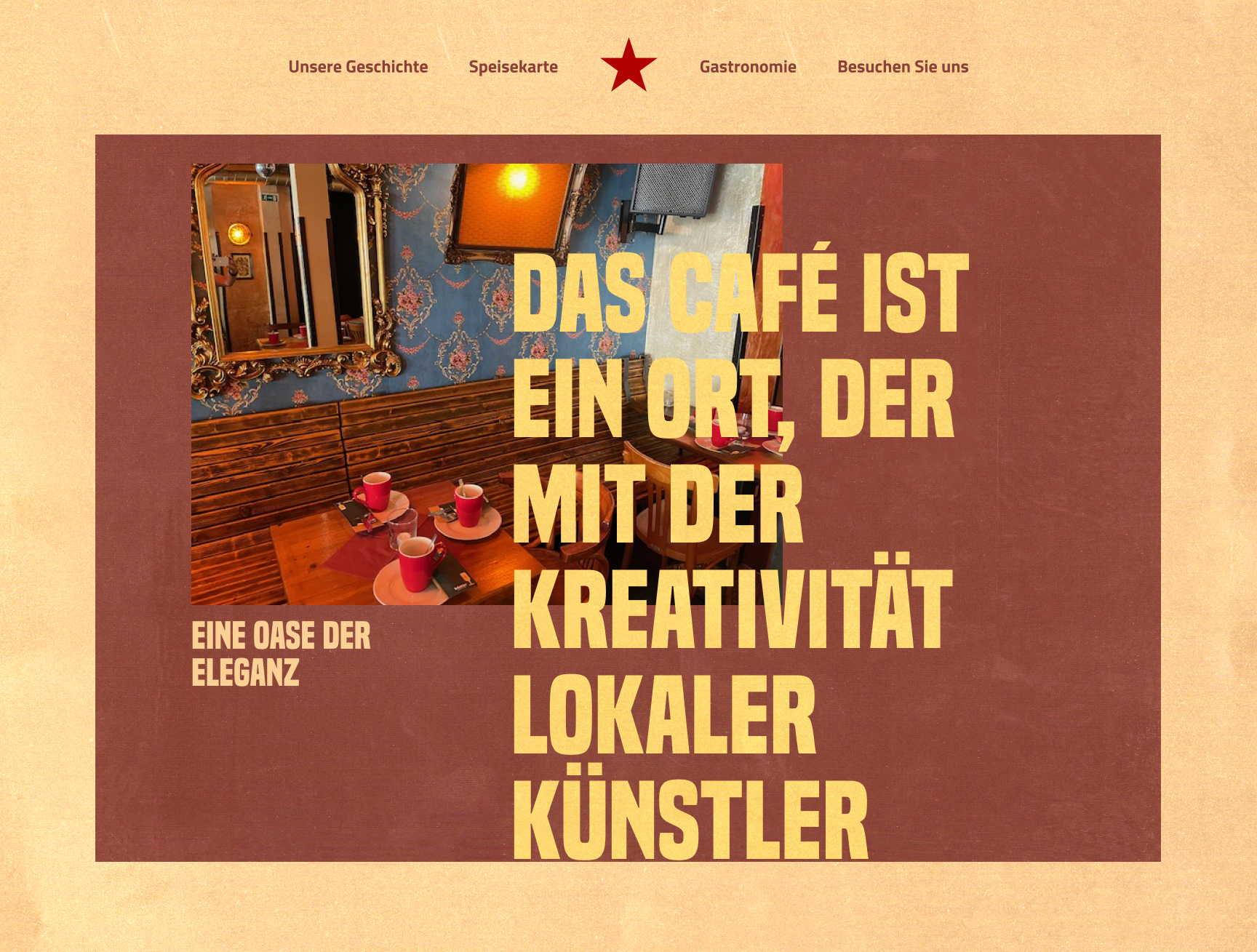
On desktop, the type is given full room. Headlines fill the viewport. Photography is used as a canvas for the type rather than a backdrop behind it. The café's cultural ambition reads at every scale.