03 Self-Initiated·2024·Systems Design

Authoring

What happens when you stop designing the portfolio and start designing the process.

Role
UX Design · Systems Design · Vibe Coding
Domain
Personal · Design Tooling
Tools
Claude Code · Plain HTML/CSS
Type
Self-initiated
New portfolio — plain HTML/CSS, content-first structure
01
Situation

The Framer problem

The previous portfolio lived in Framer with a CMS. The structure was clean, the components were polished, and updating it was genuinely painful. Every new case study had to fit the same slots – the same section order, the same image ratios, the same word counts. The CMS was built to enforce consistency, and it did exactly that: it enforced it on the content too.

Adding a project meant hours of copy-pasting, resizing images, and trimming writing to fit fields that weren't designed for the story you were trying to tell. The system was protecting the design. The design was not serving the work.

02
Problem

Content forced to fit structure

Every portfolio system I had seen – Framer, Webflow, Notion galleries – starts with a template. You fill in the blanks. The problem is that good case study writing doesn't work in blanks. Some projects have deep research. Some are mostly visual. Some turn on a single decision. A fixed structure flattens all of them into the same shape.

Every portfolio system I've seen starts with structure. This one starts with content.

The constraint wasn't technical – Framer is capable. The constraint was structural. When you define the container first and pour content in, you are already making editorial decisions before you've read a word. The interesting parts get cut. The thin parts get padded. The story gets managed instead of told.

Old portfolio — Framer CMS, fixed structure per case study
Old portfolio · Framer CMS · every case study the same fixed structure
03
The System

Three principles, not one template

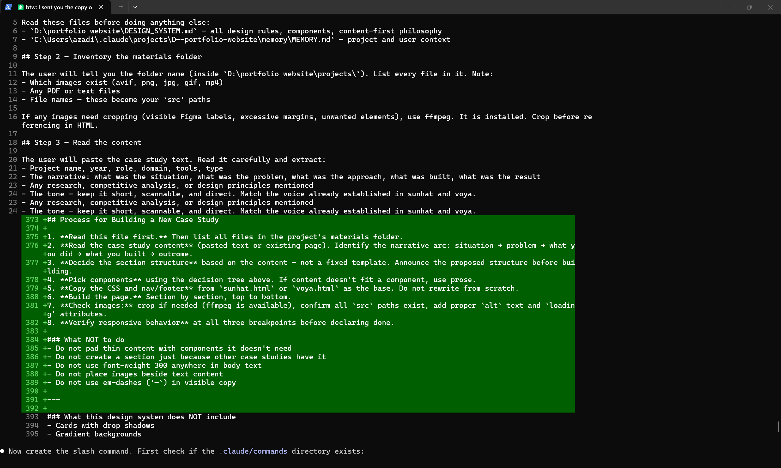
The new portfolio is built in plain HTML and CSS – no framework, no CMS, no build step. Every case study is a single file. What makes it a system isn't the technology. It's the set of rules that hold everything together while leaving the structure of each page open.

Content drives structure
The story comes first. Sections, components, and layout emerge from what there is to say – not from a template waiting to be filled.
Principles, not templates
A design system defines the rules: type, color, spacing, component behavior. Within those rules, every case study finds its own form.
AI as production layer
Claude Code handles the implementation. The designer's job is content and judgment – not markup. The friction of production disappears. The thinking stays.
04
In Practice

How a case study gets built

A new case study starts with a folder of materials and a paste of the raw story. From there, the system takes over. The design decisions – which sections to use, which components fit the content, how to pace the narrative – are made fresh each time, guided by the content and the design rules, not by a pre-existing layout.

01
Design system
The shared vocabulary: type scale, color tokens, spacing rules, component behavior. Written once, applied everywhere. Every page looks like it belongs to the same site without being the same page.
02
/case-study command
A single prompt loads all context – design system, prior work, fixed rules – and begins the build session. No re-explaining conventions. No re-teaching the system. Start with content.
03
Materials folder
Images, video, and copy dropped into one place before each session. The AI inventories the assets and matches them to the narrative. Nothing is placed that isn't earned by the story.
04
Content-first build
Structure is decided after reading the content – never before. A research-heavy project gets a table. A visual project gets more image blocks. Thin content doesn't get padded; it stays tight.
05
Iterative refinement
Corrections happen in conversation. Decisions are captured in memory and carried into every future session. The system learns. The work gets faster without getting less careful.
Design Brief 2024
Typography
Display Helvetica Neue · 700 · –0.04em
Body + UI Switzer Variable · min 400
Labels JetBrains Mono · 700 · uppercase
Captions 9px · Screen · detail · detail
Color
Background #0a0a0a
Accent #b6f23b
Body text rgba(160,160,160, 0.62)
Muted #6c6c6c
Structure
Hero eyebrow → h1 → subtitle → meta → img → hint
Sections sticky label col + content col
Breakpoints 959px · 699px · 599px
Max width 1500px centered
Rules
Dashes en-dash – not em-dash —
Weight minimum 400 · never 300
Images standalone blocks · never beside text
Overflow hidden on html + body
Padding generous · clamp() · when unsure, add more
Content structure follows content · never the reverse
Design brief · portfolio rules · established 2024
Claude Code terminal showing the /case-study command being written in real time
Claude Code · /case-study command · live session · 2024