08
UX Design·2023·Onboarding
Onboarding
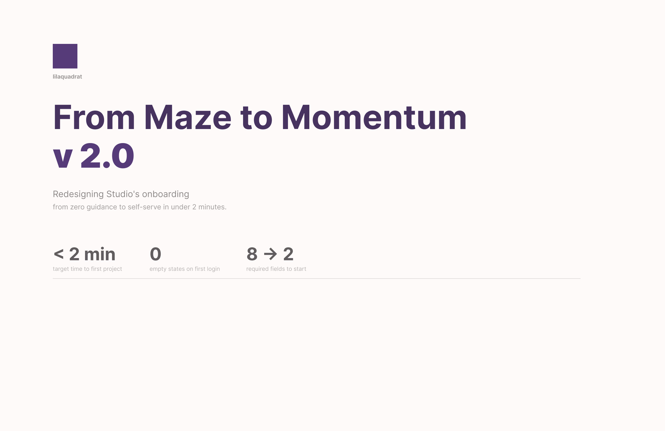
Redesigning Studio's onboarding, from zero guidance to self-serve in under two minutes.
Redesigning Studio's onboarding, from zero guidance to self-serve in under two minutes.
It started as an invite-only internal tool. No sign-up flow, no welcome screen, no guidance. The app assumed you already knew what you were doing – because for years, everyone who used it did.
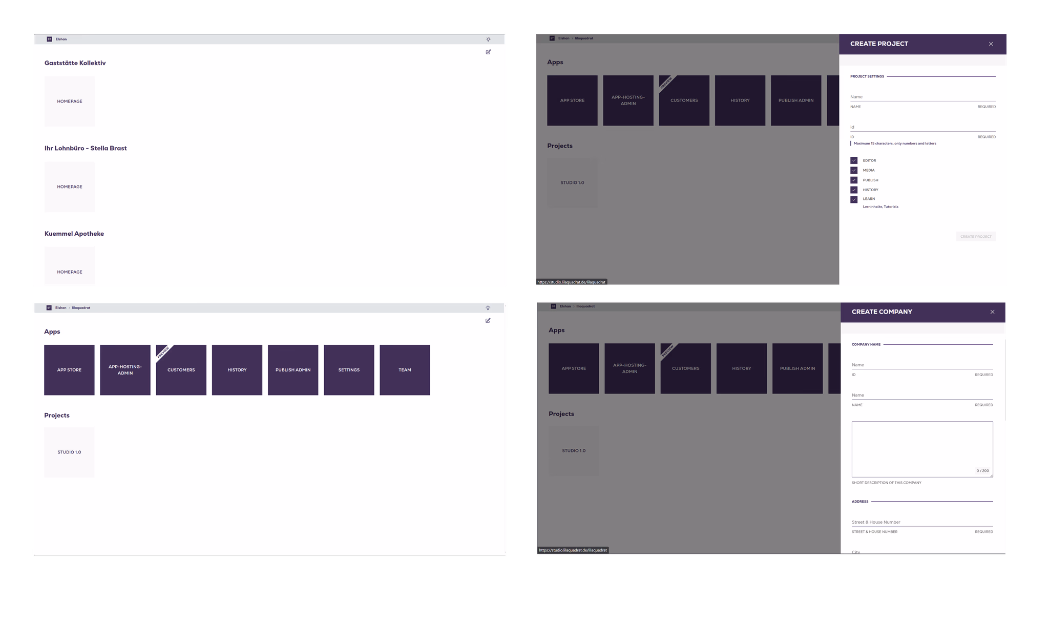
When it opened to new users, nothing changed. They landed in the same blank application grid the internal team had always navigated by instinct. The product had no entry point for outsiders.
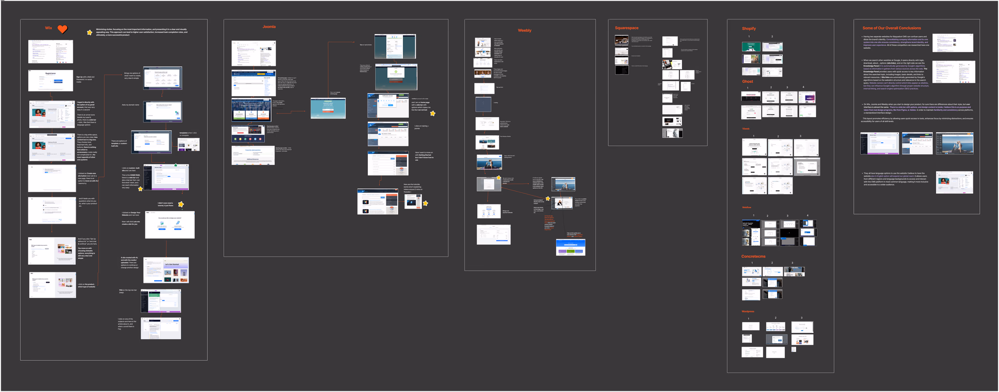
A competitive audit across Wix, Squarespace, Webflow, Ghost, Shopify, WordPress, and four others. Not to copy what they do, but to understand what makes onboarding feel effortless versus alienating. Four patterns appeared in every successful flow.
The first iteration still started with "Create a company." Structured, logical – but it put the platform's data model in front of the user's actual intent. No one opens a new tool thinking about corporate hierarchy.
The second direction introduced a single entry point, but forced users to choose between internal concepts on their first screen. Container-first thinking, dressed up in cleaner UI.
Users think in terms of what they're building,
not how the data is organised.
Every flow that led with "Company" was adding friction without adding value. The architecture made sense to us. It meant nothing to someone logging in for the first time.
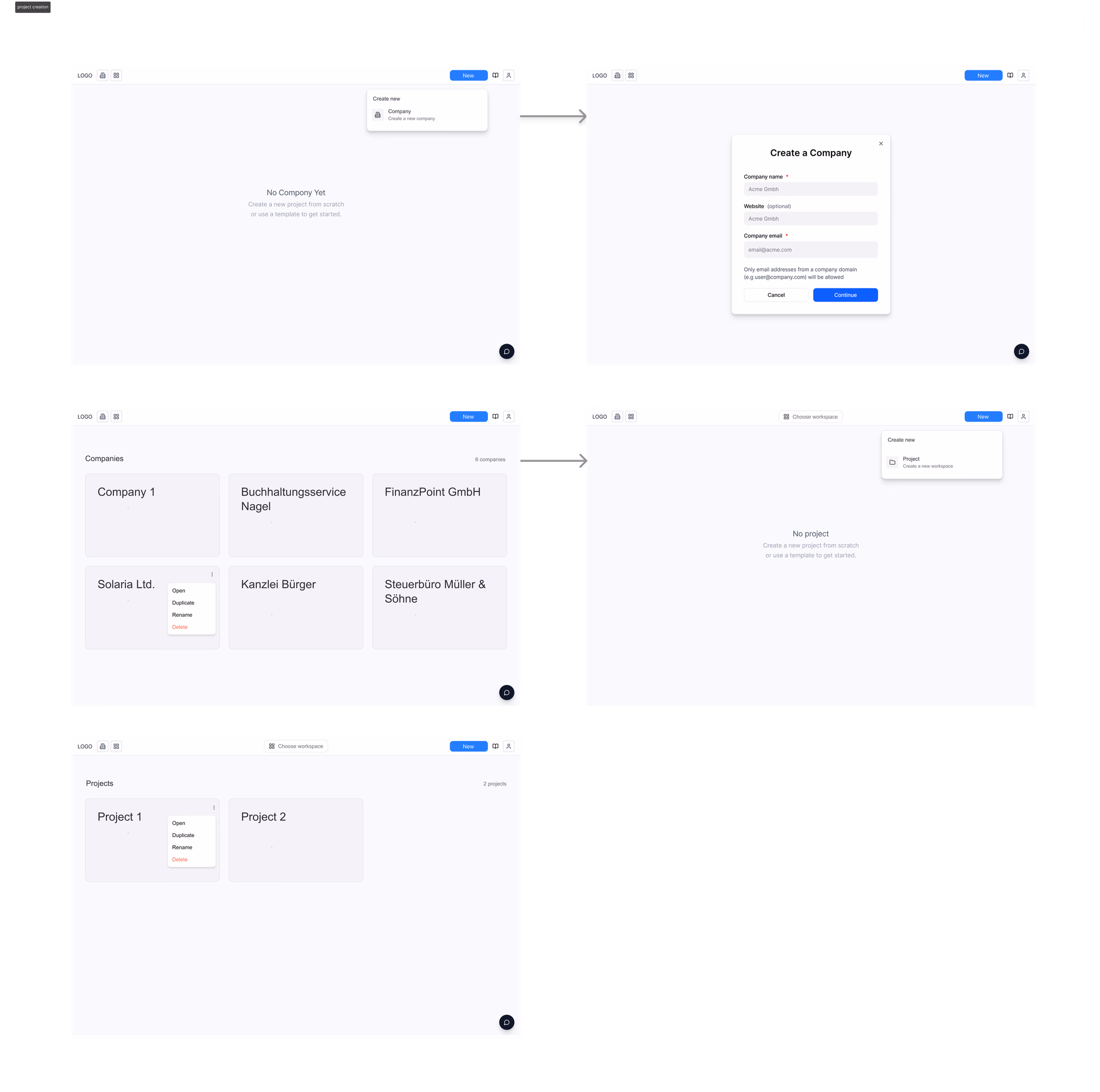
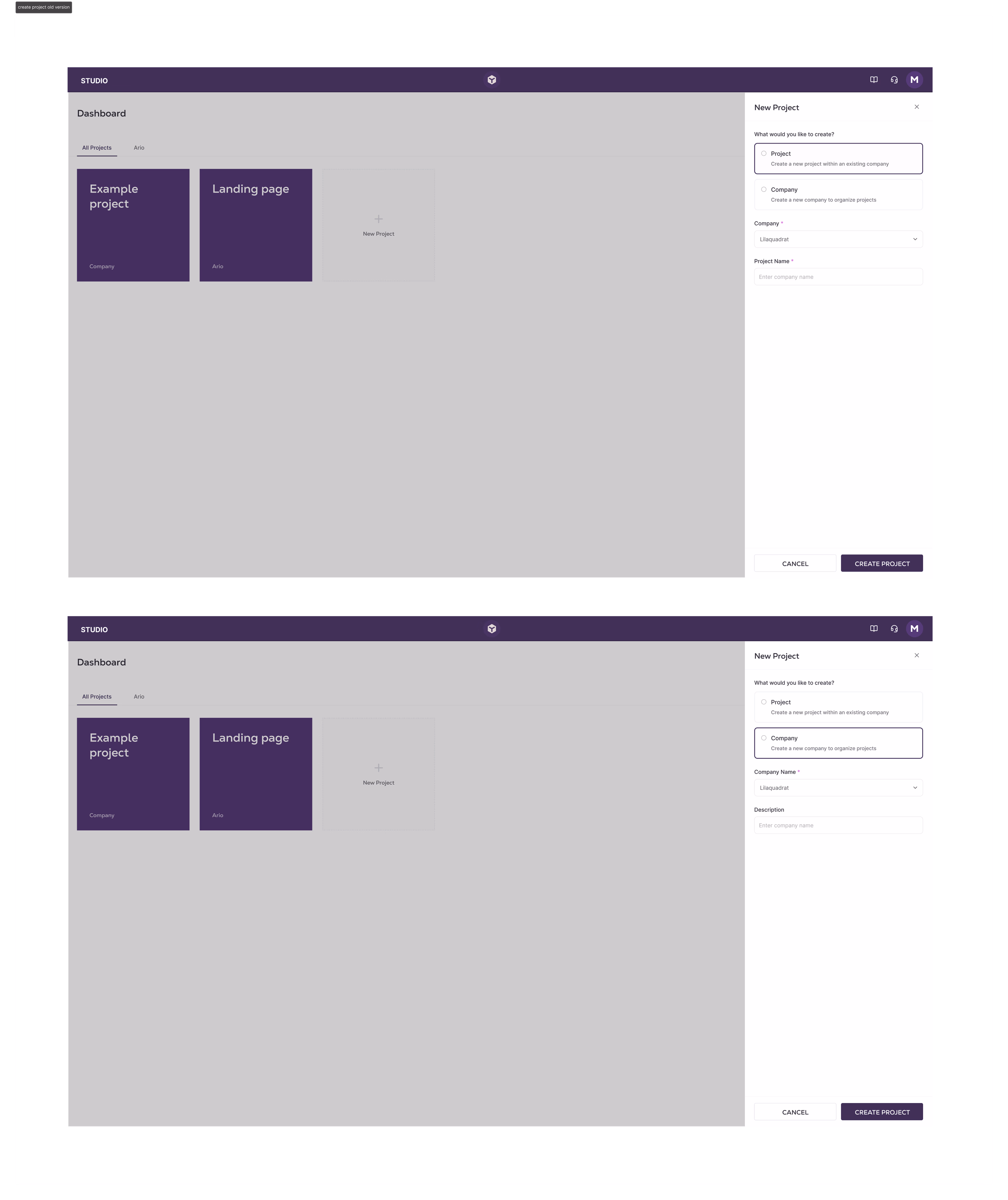
After login, new users move through a short conversational wizard – four steps, all skippable. It asks how they want to start, names their company and first project, then routes them straight to the dashboard. No architecture exposed, no heavy forms, no empty state.
The wizard is the opposite of a form. It asks one question at a time, accepts partial answers, and never reveals why it's asking. By the end, the user has a working project and no idea they just created a company record.

Project tiles became the primary navigation surface. Company name becomes a secondary label – visible, but not the thing you click. A filter dropdown replaces fixed tabs, so the structure scales to any number of clients without navigation breaking down.
"My First Project" is always pre-seeded. No user ever lands on an empty screen.
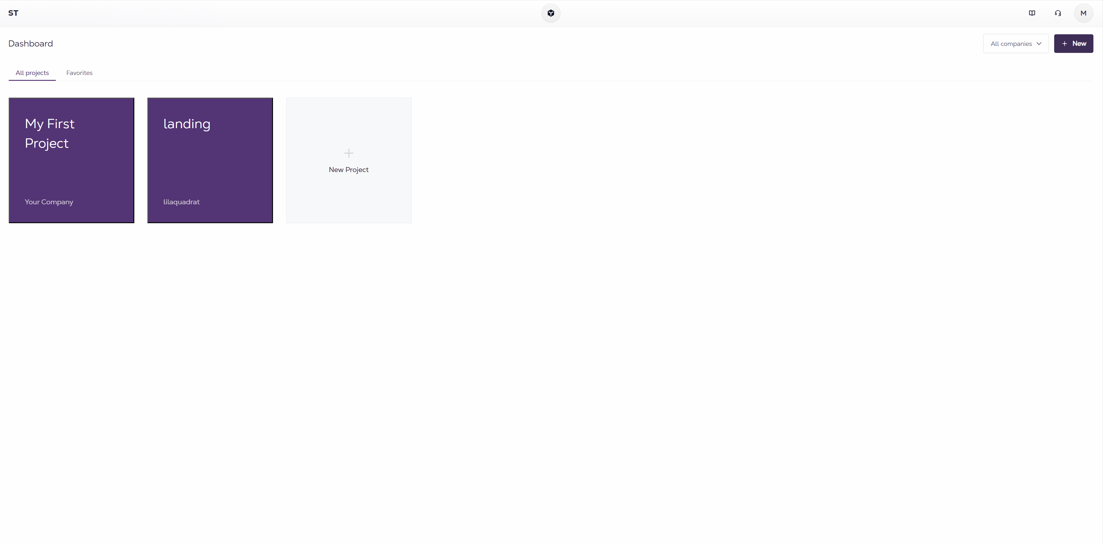
Every new user lands with a project already waiting. The empty state problem is structurally impossible – the wizard always creates one before it ends.
The Company → Project hierarchy still exists in the data layer. On day one, users never see it. Company becomes something you encounter later, when you're ready to manage multiple clients – not a gate you clear before you can start.
The navigation holds at any scale. One client or fifty, the dropdown filter keeps the dashboard readable without restructuring how anything works.