06 Platform Redesign·2026·UX/UI Design

Global
Encounters

Transforming a dated, bureaucratic application platform into a warm, editorial experience worthy of what Global Encounters offers its community.

Role
UX/UI Design
Domain
Community Platform
Tools
Figma
Type
Platform Redesign
Redesigned Global Encounters login with full-bleed Amber Fort photography and a single white form container centred over the image
01
Situation

A programme platform that felt like filing a form

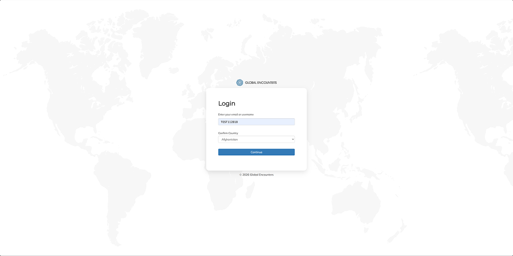
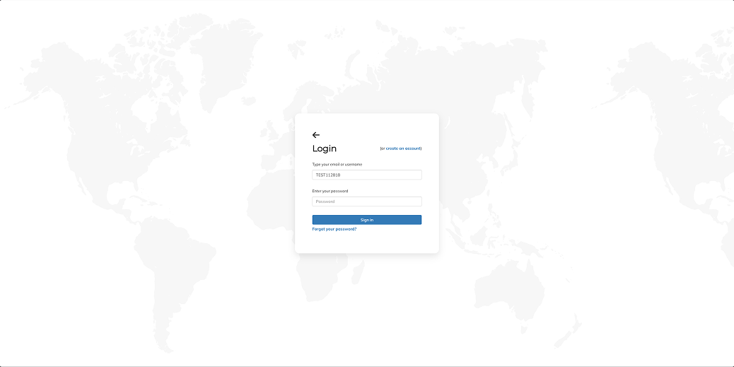
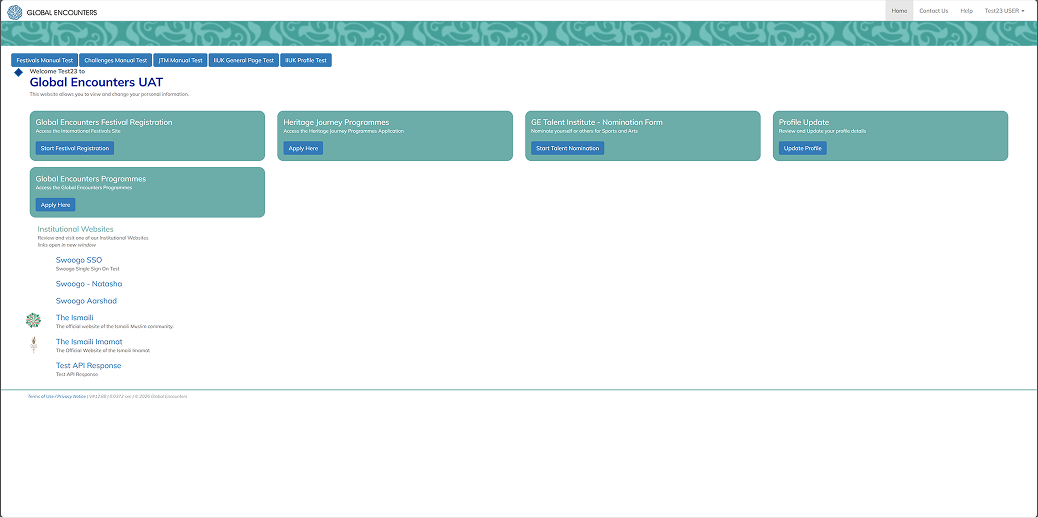
Global Encounters runs heritage travel journeys, youth camps across 36 countries, and talent programmes for the global Ismaili community. The ii-platform is the application portal for all of them – Heritage Journeys, GE Camps, the Talent Institute, and facilitator roles.

Despite the significance of these experiences, the application journey felt transactional. The existing platform presented information-heavy forms with no sense of destination, no progression, and no emotional connection to what applicants were signing up for. The redesign reimagines the full journey – from the login screen to deep inside the application form – as something that feels like the beginning of a journey, not an administrative task.

Legacy login step 1 showing only email and country fields over a faded world map background
Legacy login · step 1 · email and country over a world map
Legacy login step 2 showing password field on a separate screen with a back arrow
Legacy login · step 2 · password split onto a separate screen
02
Problem

Six things the platform got wrong

Each issue existed independently, but together they produced the same result – a platform that felt nothing like the programmes it served.

01
No sense of destination
The login and dashboard gave no visual signal of where these programmes would take you. Photography – the primary communicator of aspiration – was absent entirely.
02
Forms with no progression
Multi-step application forms presented all fields simultaneously with no progress indicator, no sense of scope, and no orientation moment at the start.
03
Generic visual language
Mulish Extra-light and rounded corners gave the platform a generic SaaS appearance at odds with the heritage and cultural character of the programmes.
04
No sub-brand differentiation
Heritage Journeys, GE Camps, the Talent Institute, and other programmes were visually identical. No colour or identity signal distinguished one from another.
05
Unclear applicant selection
Users applying on behalf of family members had no clear way to select who the application was for, or to distinguish in-progress applications from starting fresh.
06
Dashboard without hierarchy
Programmes, tools, links, and account information competed at equal visual weight – no signal of what to act on versus what was simply available.
Legacy Global Encounters dashboard with five equal-weight teal programme cards and no visual hierarchy between them
Legacy dashboard · five equal-weight cards · buried resume flow · no visual hierarchy
03
Insight

The platform should feel like the beginning of a journey, not like filing a form.

Every design decision flows from this. From the destination photograph behind the login screen to the progress indicator that appears the moment you enter the form. The platform earns the user's anticipation before it asks anything of them.

04
Design

Six screens, each with one job

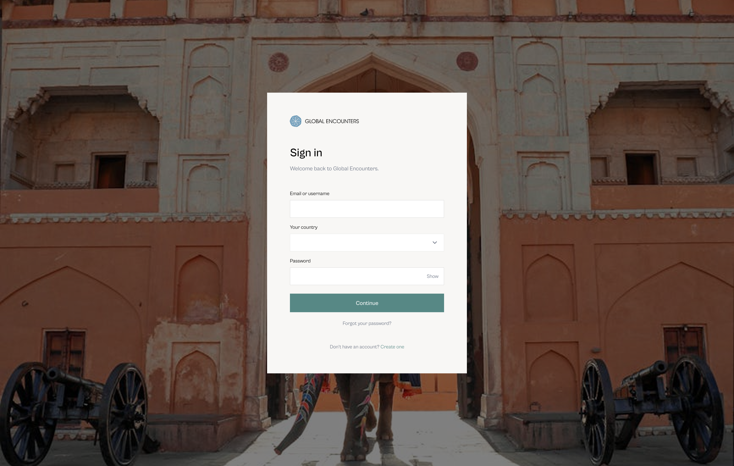
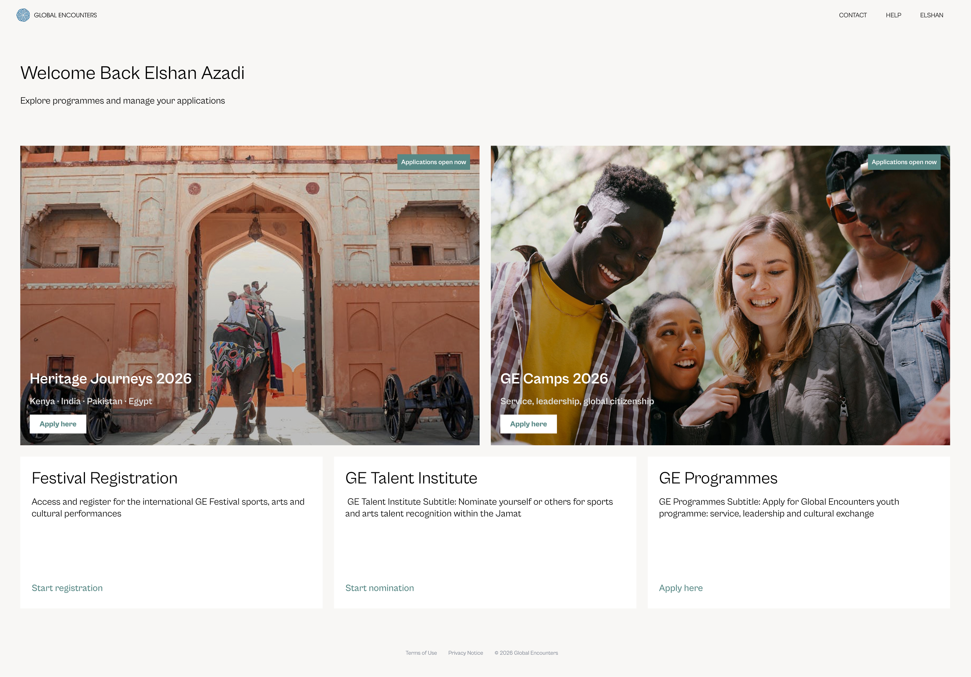
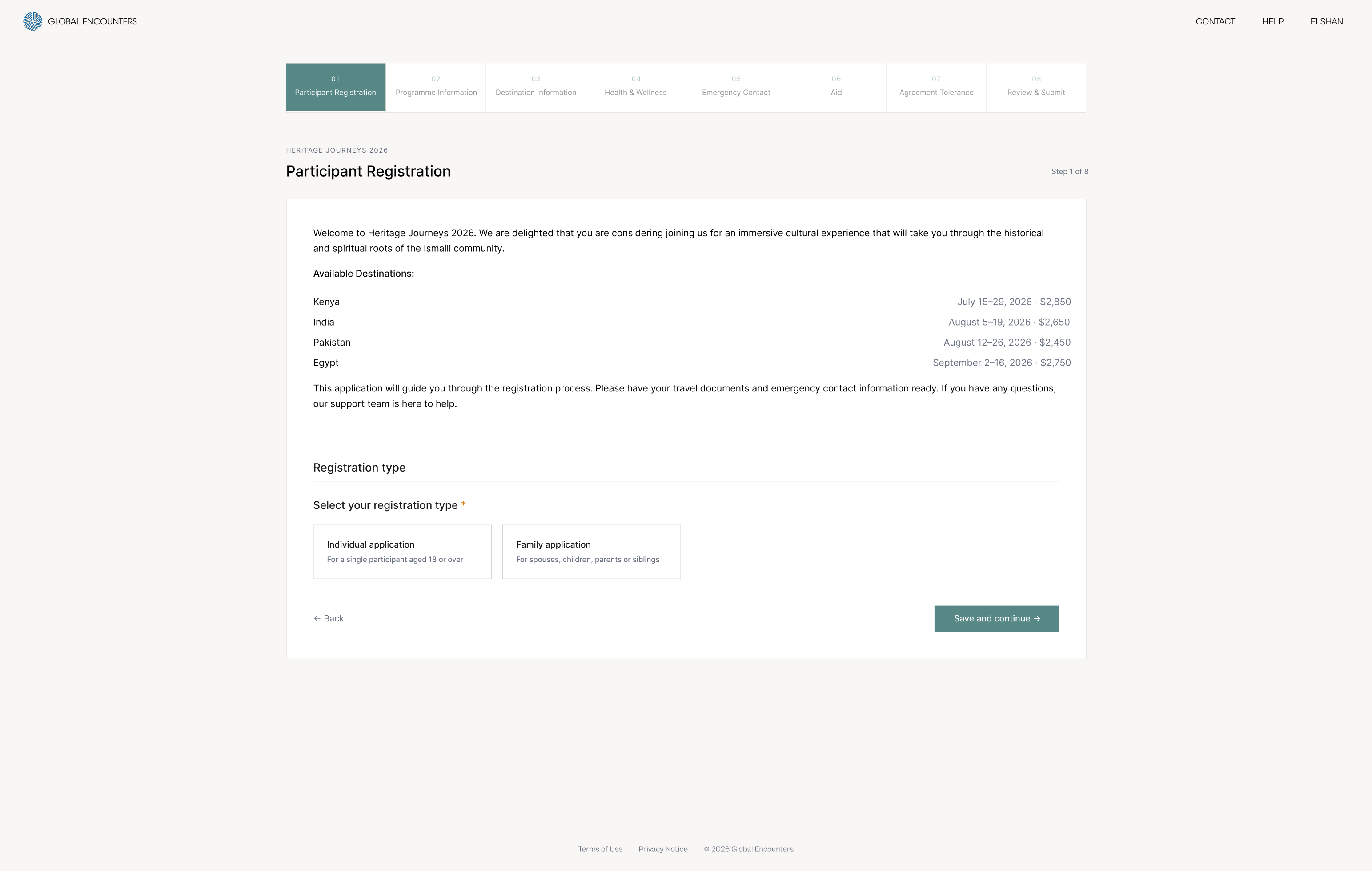
The prototype covers the complete path from login to deep inside the Heritage Journeys application. The redesigned login collapses email and password onto a single screen – a full-bleed photograph of the Amber Fort replaces the faded world map. Before the user types anything, they know what the platform is for.

The dashboard opens with a personal greeting and two hero programme cards, each carrying destination photography and an Apply Here button. Three text-link items handle secondary programmes below the cards. The visual distinction between hero cards and text links is the message – photography signals programmes worth dwelling on, text links signal utility.

Redesigned Global Encounters dashboard with two large hero programme cards carrying destination photography and three text-link items below
Redesigned dashboard · two hero cards with destination photography · three text-link items

Programme selection

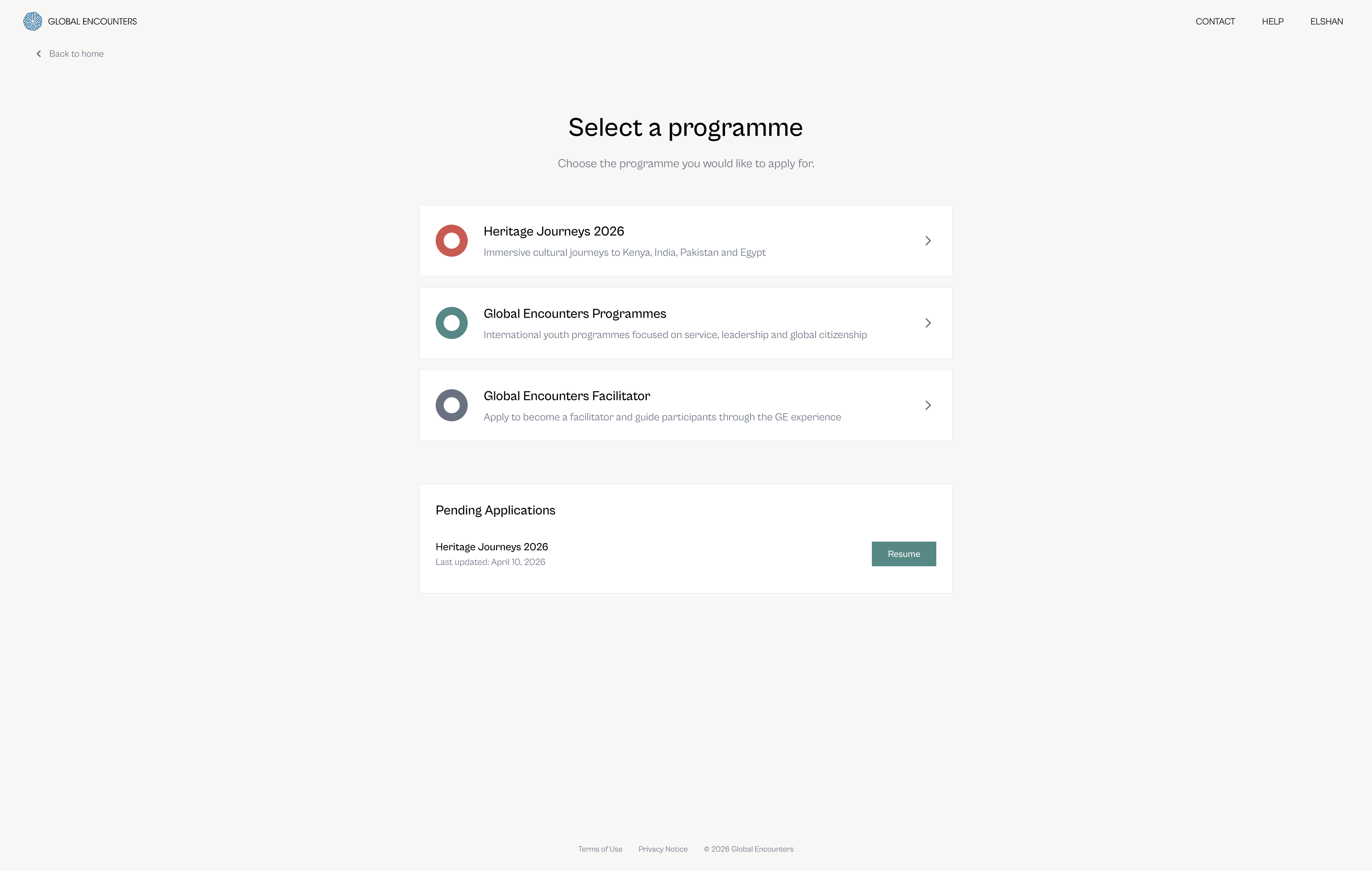
Selecting a programme is a list, not a card grid. Three options – each with a sub-brand colour circle, a title, a one-line description, and a right-facing arrow. Pending applications surface on the same screen. The user never has to wonder whether they've started before, or hunt through account settings to find it.

Programme selection screen showing Heritage Journeys, GE Programmes, and GE Facilitator as a clean list with sub-brand colour circles, and Pending Applications below
Programme selection · list not cards · sub-brand colour circles · pending applications surfaced inline

Who is this application for?

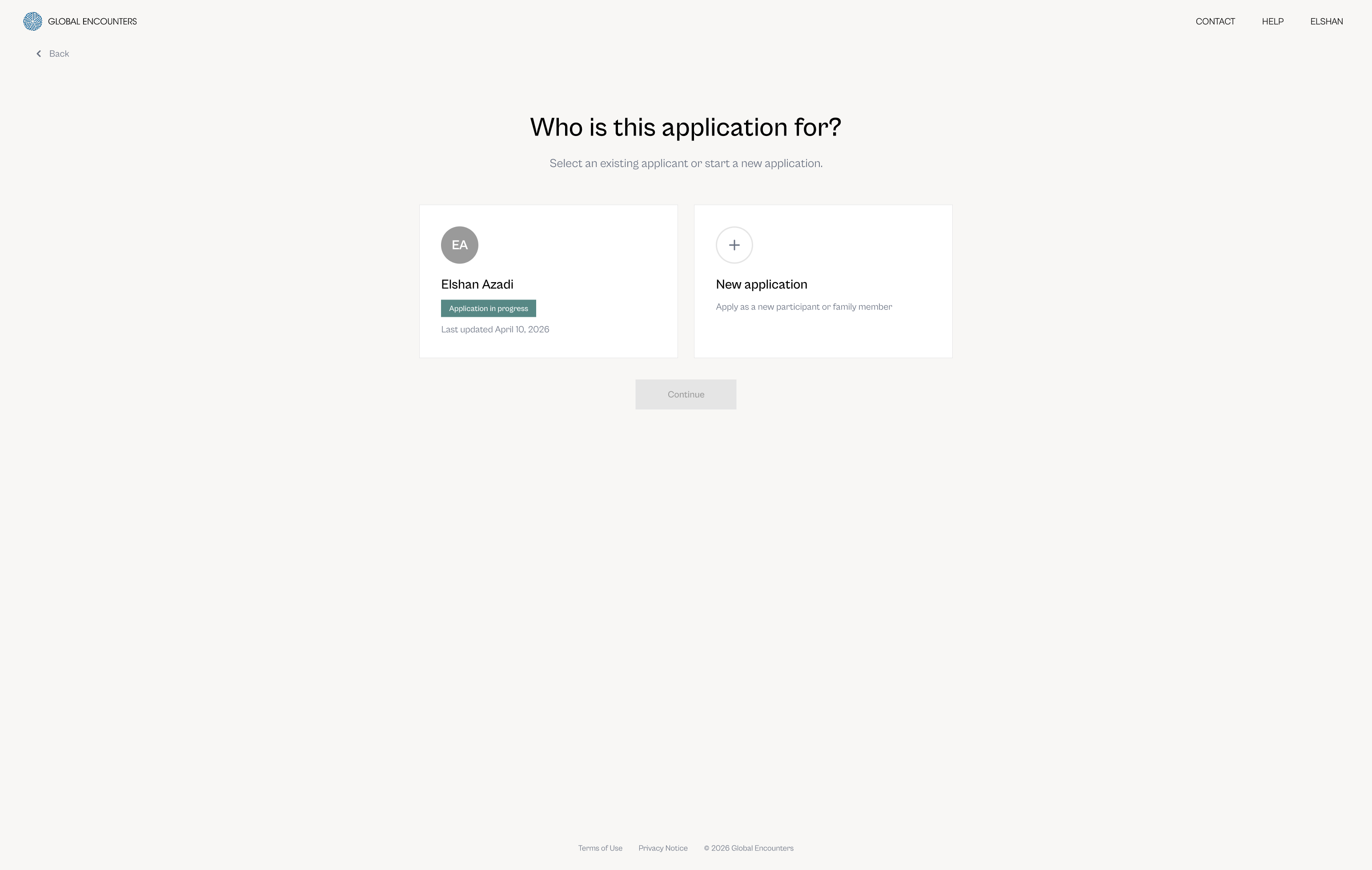
Before entering the form, applicants answer a single question: who is this for? Two cards – an existing applicant with an in-progress status badge, and a new application with a plus icon. The Continue button remains inactive until a selection is made. One question, two options, no ambiguity.

Applicant selection screen with two cards – existing applicant Elshan Azadi with Application in Progress badge, and New Application – and an inactive Continue button
Applicant selection · one question · in-progress status badge · continue inactive until selection

Inside the form

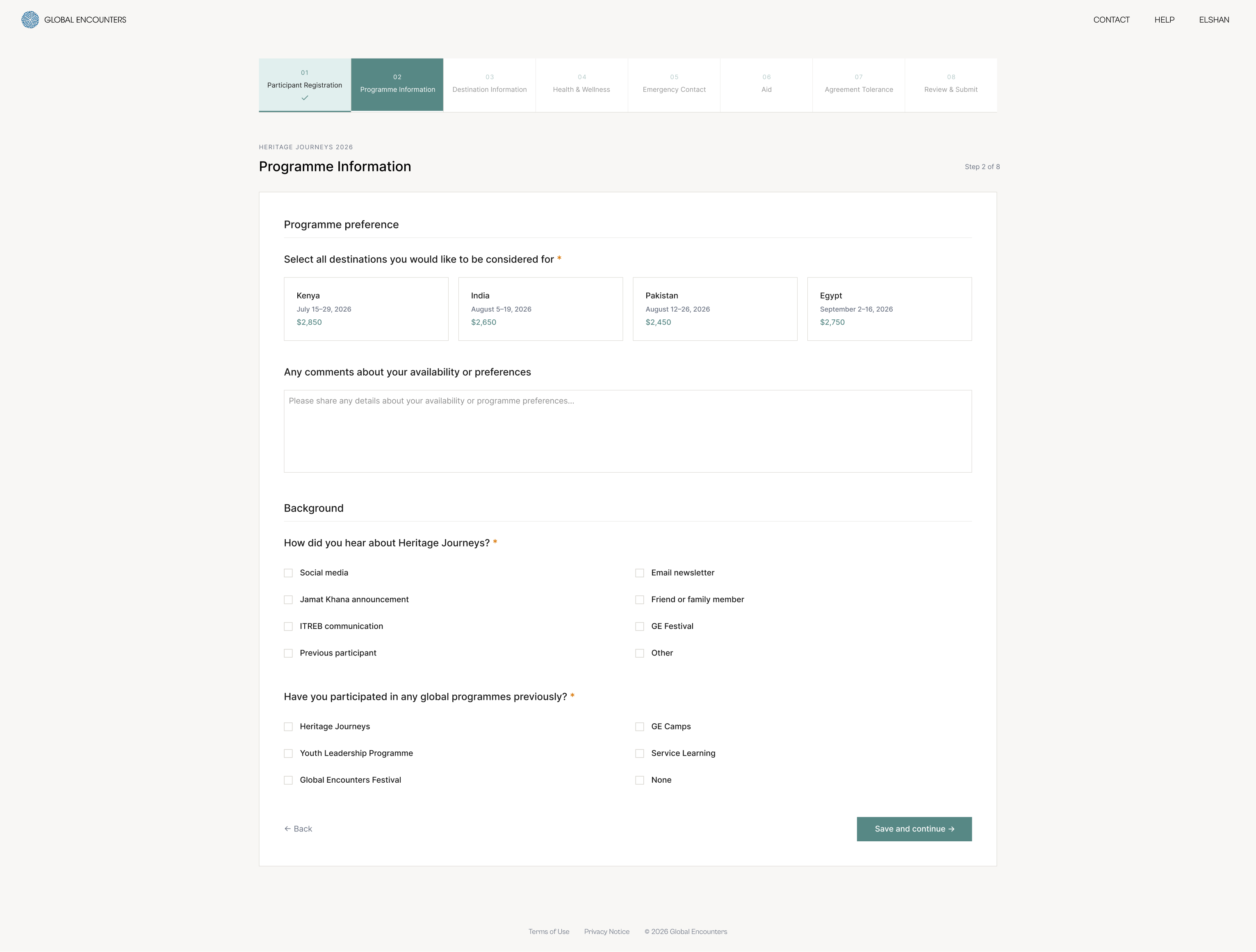
Step 1 opens with an orientation moment – a brief welcome paragraph, all available destinations with dates and prices, and a progress indicator that appears before a single field is filled. Step 2 captures programme preference, availability notes, referral source, and prior participation. Related questions group naturally without section headers that interrupt the flow.

Legacy Heritage Journeys registration form showing all eight steps as simultaneous tabs before a single field is filled, with dense text content and no progress indication
Legacy form · all 8 steps as simultaneous tabs · no progress indicator · no orientation moment
Heritage Journeys application step 1 showing a progress indicator at the top, a welcome message, a destination table with dates and prices, and registration type card selection
Step 1 · participant registration · progress indicator · destination table
Heritage Journeys application step 2 showing destination preference as selectable cards with prices, availability comments field, and referral source checkboxes
Step 2 · programme information · destination cards · referral and history
05
System

Six visual language decisions

Established in Milestone 1 and carried unchanged into subsequent platform work. Together they define what the platform looks and feels like at every point in the journey.

01
Cabinet Grotesk
Geometric grotesque with warmth and character. Replaces the generic Mulish Extra-light – close to the official ITC Avant Garde Gothic from the brand guide but optimised for digital interfaces.
02
Sub-brand colour
Each programme carries its official sub-brand colour as an accent. Teal is reserved for all interactive elements throughout the platform – buttons, links, selection states, progress indicators.
03
Photography as context
Destination photography is not decoration – it is context. Used where dwell time is appropriate (login, dashboard hero cards) and withheld where speed is needed (programme selection, form steps).
04
No rounded corners
Sharp edges throughout. An intentional editorial aesthetic that differentiates the platform from the generic SaaS look and connects to the cultural and heritage tone of the brand.
05
Cream background
#F8F7F5 – warmer and more human than cold white. White is reserved for form containers and cards, creating hierarchy between page and content without using grey.
06
One decision per screen
Every screen has exactly one job. Progressive disclosure replaces information overload – users are never asked to do two things at once.