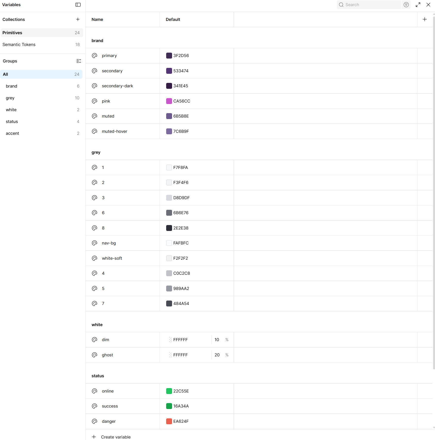
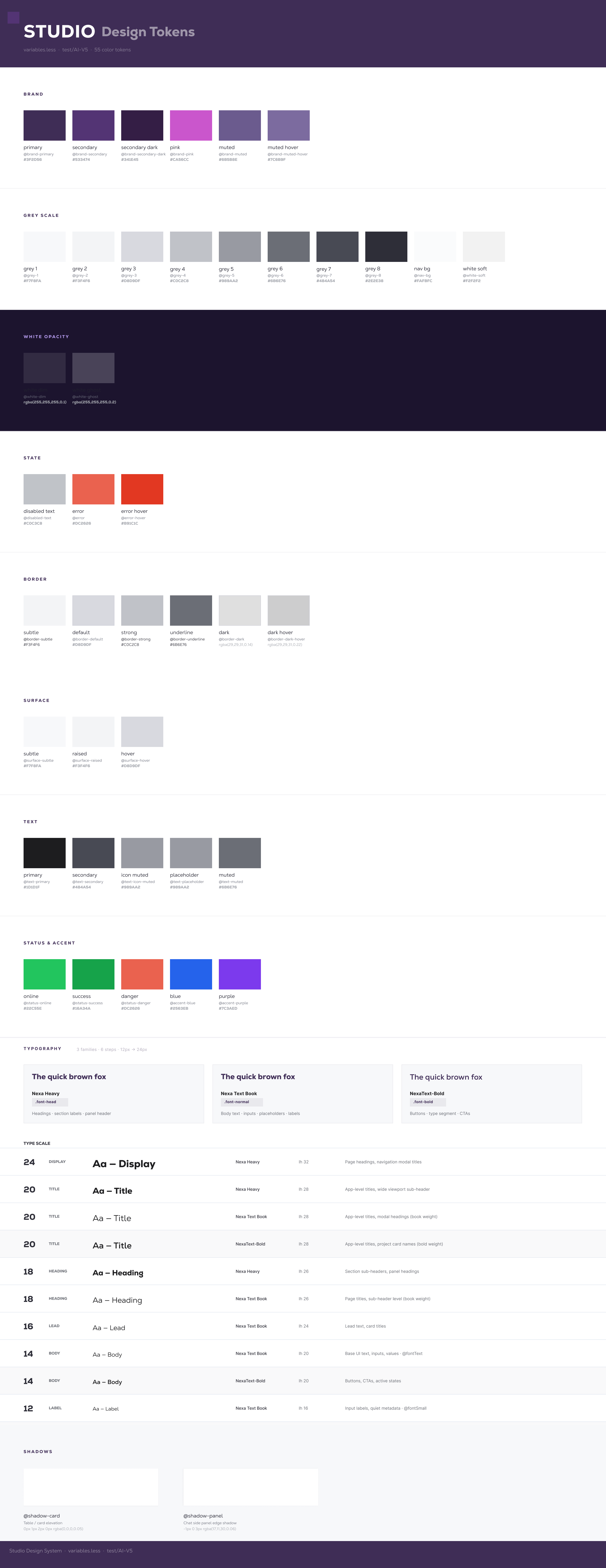
Primitive collection · 24 raw values · brand · grey · status
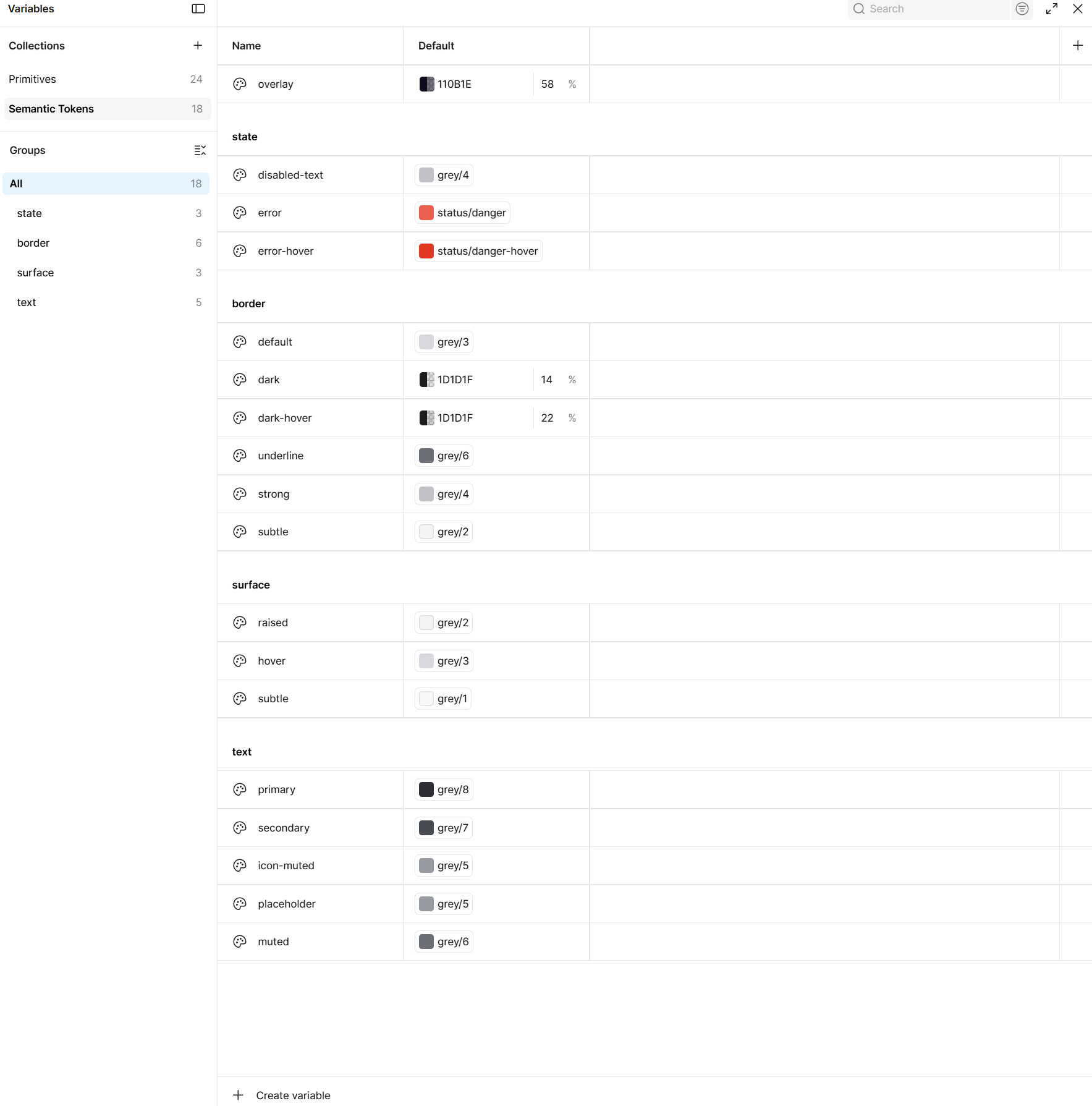
Semantic tokens · 18 tokens · references primitives · state · border · surface · text
A production design system where Figma and Vue share the same source of truth. No handoff. No drift.
lilaquadrat builds content management tools for creative agencies. As the product scaled, the gap between Figma and the Vue codebase grew. Design decisions weren't reaching production accurately and there was no structured way to catch the drift.
Before a single component was built, the token architecture was defined in Figma as four variable collections. Every color, spacing value, and radius in the system references a variable. No hardcoded values, anywhere. Change a token in Figma and the change propagates everywhere it is referenced in code.
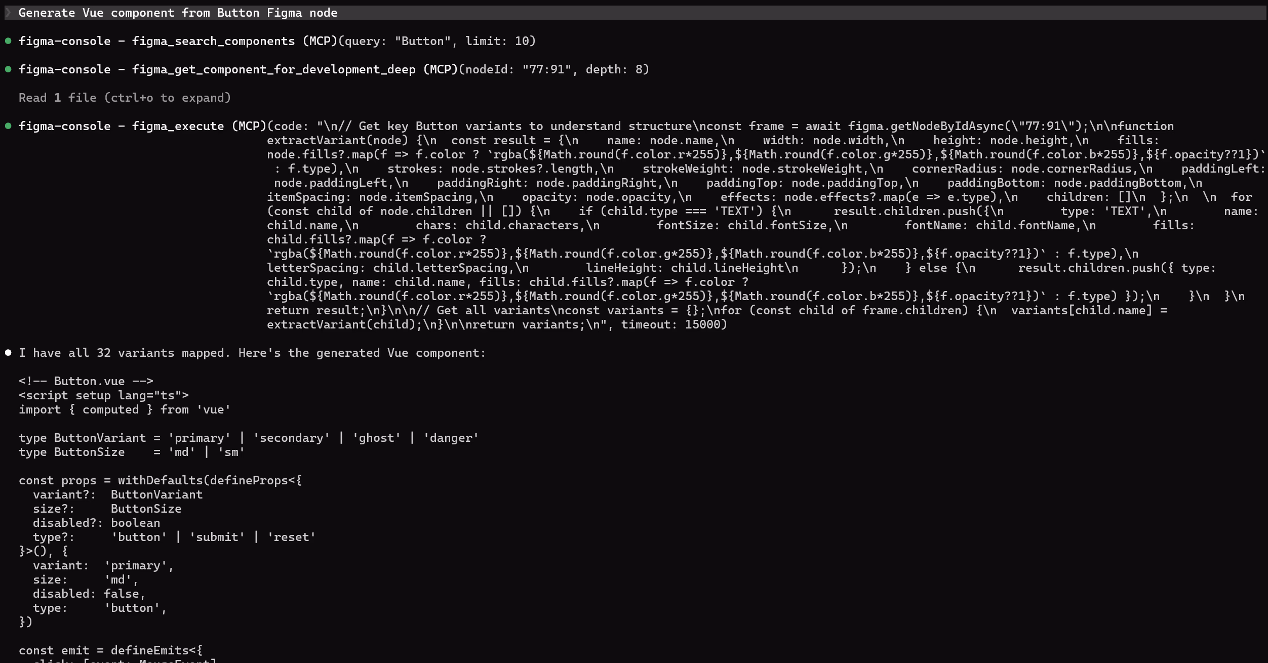
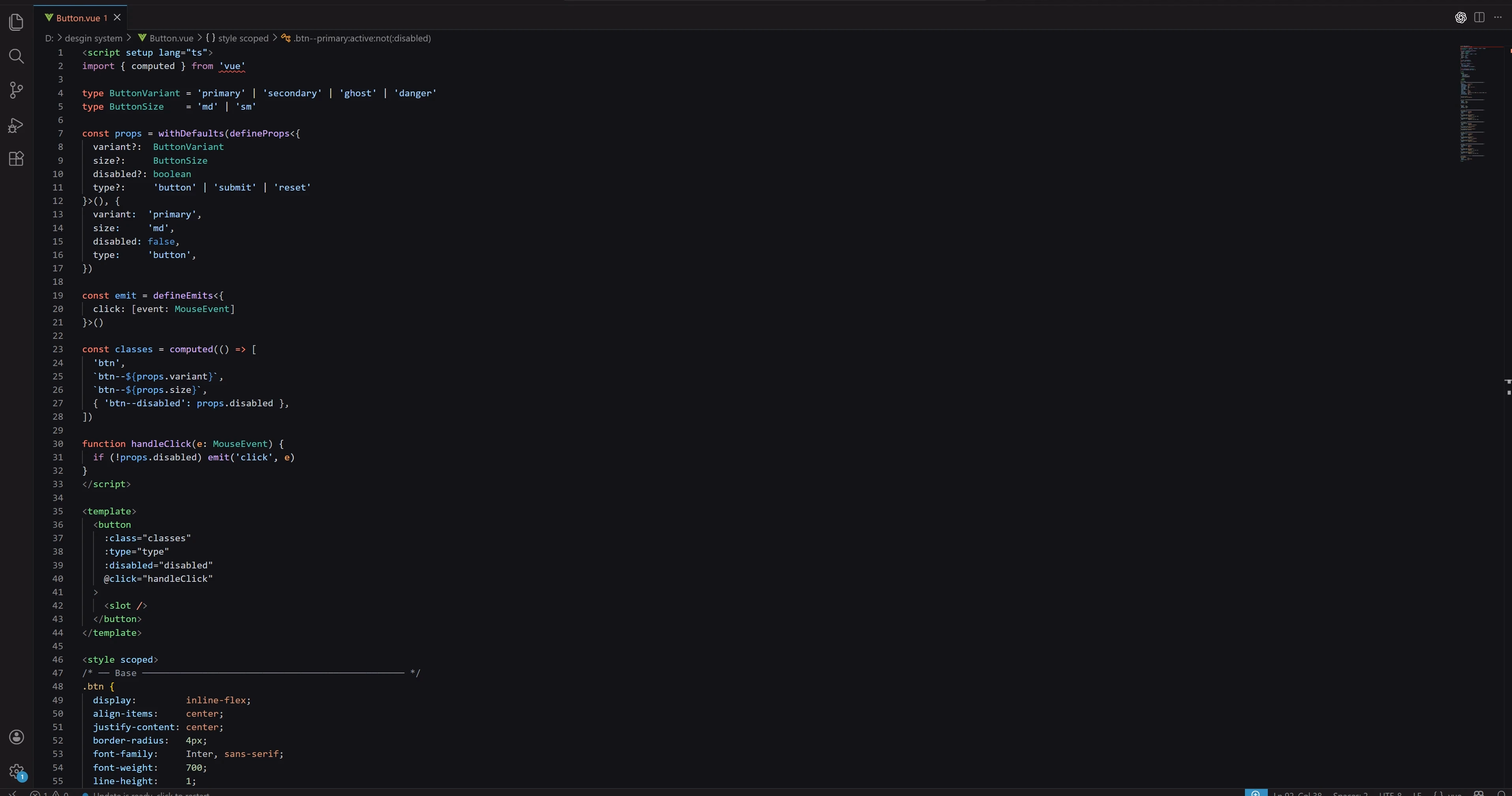
Every component is a Figma ComponentSet with named variant properties, variable-bound fills, and documented states. No loose frames, no static mockups. Each component in Figma has a direct counterpart in the Vue codebase, generated and kept in sync through Claude Code reading design intent directly from the file.
16 component sets, each in a labeled section frame with a full variant matrix. Every state documented. Every fill token-bound. No ambiguity in handoff – because there is no handoff.
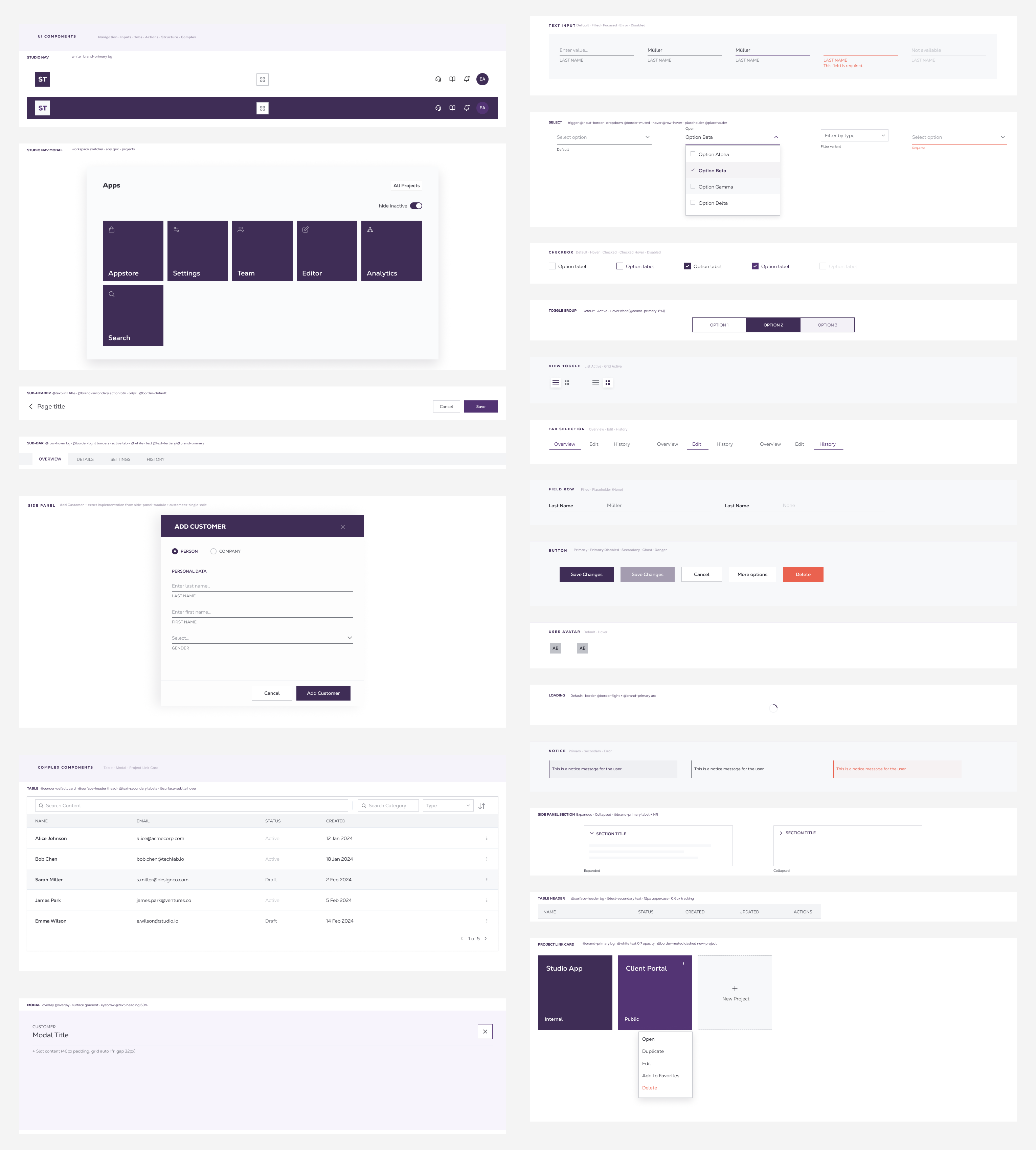
A bidirectional workflow between Figma and Vue. Claude Code reads design intent directly from the Figma file via MCP, generates Vue components with CSS variables mapped to Figma token names, and syncs changes back. No handoff step. No redlines. No translation layer between design and code.
Building the system was one challenge. Keeping it accurate as the product evolved required a different approach. Instead of informal communication that gets buried, a structured audit runs on a schedule – three checks, each with a clear pass or fail.
/src/components/. Missing components surface immediately.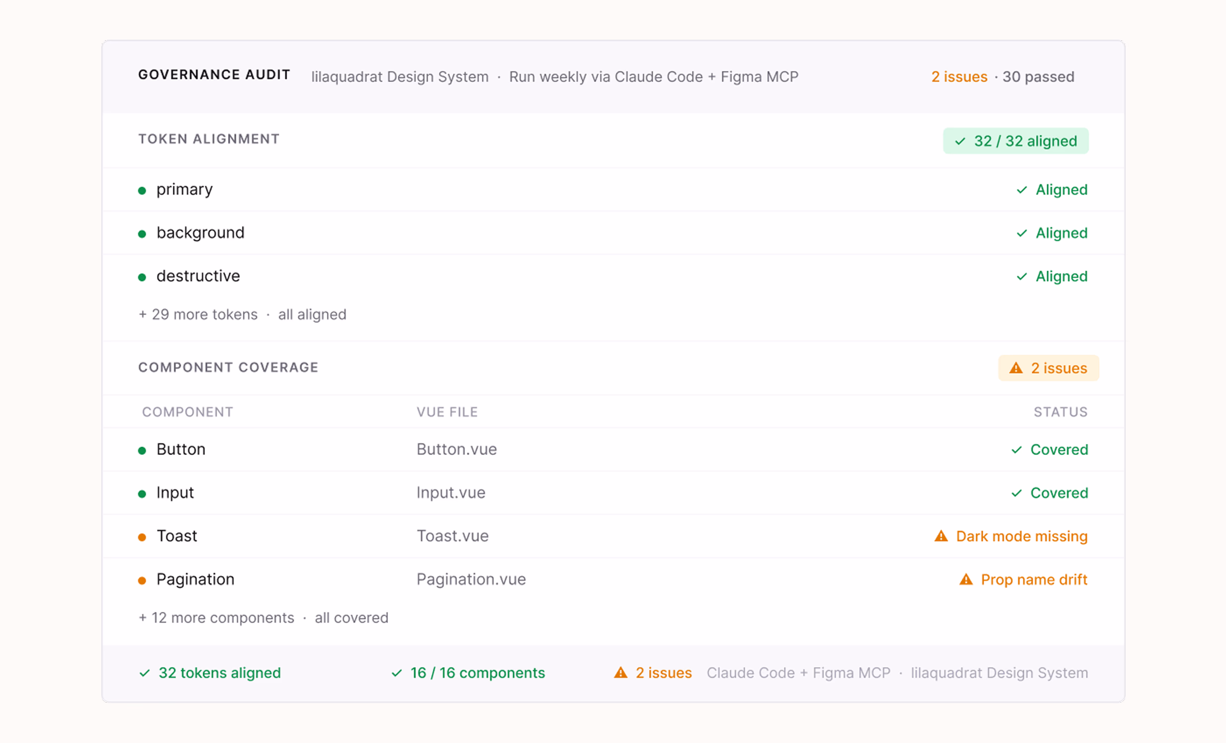
A design system that doesn't drift. Token-bound in Figma, enforced in code, audited on a schedule.